Friday, 6 May 2011
Contents page analysis
This contents page is of a magazine called 'drummer' its quite creative and makes good use of pictures. Focussing on the magazine idea drumming. The green plus sign and use of puffs make it clearly understood which i took ideas to implement in my own magazine
Double page spread analysis
This double page spread is quite creative with the use of cut out newspaper effect for the title in varied capitals and lower case font. The picture is quite in your face with the leaning towards pose which creates the idea she is talking in your face. Also the hand on hips approach follows this. The main headings are clear and the information is collumned on the first page. The colours are quite bland but gives it a good effect. We notice that the font is red, just like her top which gives the page a sense of colour scheme
Tuesday, 3 May 2011
Semiotics
Semiotics, also called semiotic studies or (in the Saussurean tradition) semiology, is the study of signs and sign processes (semiosis), indication, designation, likeness, analogy, metaphor, symbolism, signification, and communication. Semiotics is closely related to the field of linguistics, which, for its part, studies the structure and meaning of language more specifically. Semiotics is often divided into three branches:
- Syntactics: Relations among signs in formal structures
- Pragmatics: Relation between signs and the effects they have on the people who use them
Semiotics is frequently seen as having important anthropological dimensions; for example, Umberto Eco proposes that every cultural phenomenon can be studied as communication. However, some semioticians focus on the logical dimensions of the science. They examine areas belonging also to the natural sciences – such as how organisms make predictions about, and adapt to, their semiotic niche in the world (see semiosis). In general, semiotic theories take signs or sign systems as their object of study: the communication of information in living organisms is covered in biosemiotics or zoosemiosis.
Thursday, 28 April 2011
Wednesday, 27 April 2011
Introduction - Bio
My name is paul roberts and im 18. I am creating a magazine and documenting my progress on blogger of the different stages. I will be uploading drafts and analysing magazing covers of my chosen genre which is rock/metal. This genre focuses on a darker colour scheme and different trends in terms of clothes etc.. i will try to base myne around this steretype.
Thursday, 21 April 2011
Contents Page Progress - #2
I had a change of plan with the contents and re arranged around alot of the ideas i first had and made it like this. Still need to add some pictures and possibly more colour
Contents Page Progress - #1
I started my contents page like this. It didnt take as long because id used photoshop for the front cover so i had more of an idea. I used a brush effect which i did manually to create the cross brush effect. Then adding fireworks to the beggining of the work competition. Again to add more visual than texte based.
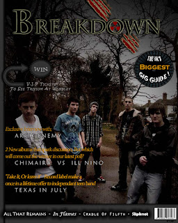
Front Cover Progress #4
Proceeding this i added additional headings to this which made the magazine come together. Again seperating the main details with the less important details through the size of font ad colour
Front Cover Progress #3
Following the previous one i placed a fire background beneath the 'win' layer and drawn a shape over the top. Then i carefully used the eraser on 200% zoom to outline the fire so it looked part of the shape. Initially it was a square of fire.
Front Cover Progress #2
Next I worked on the bottom of the magazine. I found a design with the shape tools then added a line to box the bottom half section seperate. Then placed a barcode and various bands in different fonts to the bottom. Again adding effects to them.
Finally I added a competition idea to the page with confetti at the end of the text to create the idea more visually than just text.
Finally I added a competition idea to the page with confetti at the end of the text to create the idea more visually than just text.
Front Cover Progress #1
I thought of a name for the magazine and experimented with different photoshop tools to creat the title/ effect. Also making sure the font was specific to my genre choice
I then added a puff to capture attention and begin to fill up the free space on the page
Thursday, 3 March 2011
Thursday, 24 February 2011
Monday, 7 February 2011
Thursday, 27 January 2011
Thursday, 20 January 2011
Subscribe to:
Comments (Atom)


